Why Mobile First Website Design Matters for Local Contractors in 2025
I have been building websites for local businesses for over a decade, and one shift I have watched reshape everything is the move to mobile first website design. When I started, a desktop layout was the main event and mobile was an afterthought. That approach no longer works, especially for contractors and service businesses in the Chicagoland area. A contractor who shows up on a homeowner's phone with a cramped, slow site is losing work before they even get a call.
The data backs this up. Over sixty percent of local searches now happen on a smartphone. For a roofer or plumber, that number can be even higher because people often search while they are actually dealing with a leak or a broken furnace. They are not sitting at a desk. They are holding a phone, looking for someone who can help now. If your site loads slowly or requires pinching and zooming, they tap the back button and call the next name on the list.
What Mobile First Actually Means for Your Site
Mobile first website design flips the old priority. Instead of designing for a wide monitor and squeezing things down to fit a phone, you start with the smallest screen and work up. This forces you to make hard choices about what matters most. On a desktop you can cram in a sidebar, a gallery, and a long footer. On a phone you have a thin strip of real estate. You need the phone number, the service area, and a clear call to action right at the top.
I have seen contractors try to save money by using a generic template that claims to be "responsive." Responsive is not the same as mobile first. Responsive just means the layout squishes and rearranges itself. Mobile first means you have thought through the user's experience on a phone from the very first line of code. Font sizes are readable without zooming. Buttons are big enough to tap with a thumb. Images are compressed so they load fast on a 4G connection at a job site.
Connect with us on YouTube.
Page Speed as a Ranking Factor
Google uses page speed as a ranking signal, and that signal is even stronger on mobile. If your site takes more than three seconds to load on a phone, you are losing visitors and losing ranking positions. I have tested dozens of contractor sites in the Chicago suburbs. Many of them have huge hero images that are not compressed, or they load multiple JavaScript files that slow everything down. A mobile first approach forces you to strip away that bloat.
One practical step is to use next-gen image formats like WebP and serve scaled-down images for phone screens. Another is to lazy-load content below the fold so the top of the page appears instantly. These are not complicated changes, but they require someone who understands mobile first website design to implement them correctly. I have seen a simple swap from a heavy slider to a single hero image cut load time in half for a roofing company in Arlington Heights.
Local SEO and Mobile Behavior
Mobile first also changes how local SEO works. People searching on a phone are often looking for immediate action: call, get directions, or visit a store. Google prioritizes sites that make those actions easy. If your contact number is not clickable, or your address is buried in a footer, you are hurting your chances of showing up in the local map pack.
I worked with a landscaping company in Des Plaines that had a beautiful desktop site but almost no mobile traffic. Their phone number was an image, not a hyperlink, so iPhone users could not tap to call. A mobile first redesign fixed that. We also moved the service area map to the top of the page and added a sticky call button. Within two months their phone leads from mobile searches doubled. That is the kind of result you get when you treat mobile first as a design philosophy, not a technical checkbox.
Navigation and Content Prioritization
A common mistake I see on contractor websites is a complex navigation menu that works fine on a desktop but becomes a tiny, unclickable mess on a phone. Mobile first website design calls for a simplified navigation structure. On a phone, you typically want no more than four or five top-level menu items. Everything else goes into a hamburger menu or gets moved to the footer.
Content also needs to be trimmed. Long paragraphs that look fine on a big screen become walls of text on a phone. Break them up with short headings and bullet points. But limit yourself to one or two lists per page. For example, a list of services might look like:
- Residential roofing repair
- Gutter cleaning and installation
- Skylight replacement
- Emergency leak patching
- Insurance claim assistance
Keep each line short and scannable. People on phones are often multitasking. They want to find what they need fast and move on.
Touch Targets and Form Design
Another detail that separates a good mobile experience from a frustrating one is touch target size. A button or link should be at least 48 pixels tall and wide. That is the size of an average fingertip. If you cram links too close together, users accidentally tap the wrong one. That is especially annoying on a contact form where a mistap might submit a half-filled query.
Forms on mobile should be as short as possible. Ask for name, phone, email, and a brief message. Do not require a street address or a project description until you have the lead on the phone. Every extra field is a chance for someone to give up. Mobile first website design prioritizes conversion over completeness. You can gather details later during the call.
Testing on Real Devices
I always tell clients to test their site on an actual phone, not just in a browser window shrunk down. The emulator in Chrome is useful but it does not simulate real thumb placement, network variability, or screen glare. Walk through your own site on an iPhone or Android device. Try to book a consultation. Try to call your office. If anything feels awkward, fix it.
There are tools like Google's Mobile-Friendly Test and PageSpeed Insights that give you a score and specific recommendations. But no tool replaces human judgment. A score of 90 out of 100 does not matter if the user still has to pinch to read your prices. Mobile first website design is about empathy for the person on the other end of the search.
Balancing Mobile First with Desktop Needs
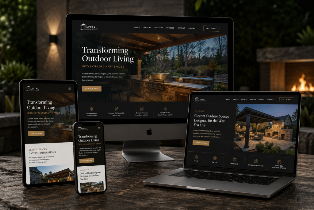
Some contractors worry that a mobile first site will look stripped down on a desktop. That is a valid concern, but good design handles both. You can use CSS media queries to add more columns, larger images, and additional content when the screen width increases. The key is that the mobile version is not an afterthought. It is the foundation. The desktop version builds on top of it.
I have seen this done well by a painting company in Naperville. Their mobile site shows a bold headline, a tap-to-call button, and three service icons. On desktop the same content expands into a full layout with a portfolio grid, a testimonials section, and a sidebar with a contact form. Both versions feel intentional. Neither feels like a compromise.
For contractors and local businesses in the Chicagoland area, investing in mobile first website design is not just about keeping up with trends. It is about making sure that when a homeowner in Park Ridge or Evanston searches for a roofer at 10 PM on a Sunday, your site loads fast, looks professional, and makes it dead simple to call you. That is how you win jobs without spending more on ads.
Lemur Marketing, located at 1574 Henry Ave, Des Plaines, IL 60016, USA, is a digital marketing agency in Des Plaines, IL offering web design, local SEO, and paid advertising services tailored to contractors and local businesses in the Chicagoland area. They can be reached at +1 630-551-8493.